Visar inlägg med etikett tutorial. Visa alla inlägg

tisdag 25 oktober 2011

My way of colouring...

Hi stampers!
Today I have a new distress ink
tutorial for you.
I made it for The Magnolia Day and
showed it at my workshop.
You can follow how I colour this new
Tilda from Sweet Christmas collection.
There is som many different ways of
colouring with distress ink reinkers.
This is just my way and as I love to read
about how other work with different
medias I hope you will enjoy this!


Here I have stamped the same image four times
so you can see how I work through the process
of colouring with Distress ink reinkers.
The ink I  use is Staz on Timber brown
as you see in the end of this tutorial.
The paper is Montval Canson 300 gram.
Brushes are Italeri 00, 000.


To the left: I  start colouring.
Skin: tattered rose mixed with vintage photo.
I always start with the face/skin as this is
the most difficult part to do, for me that is.
I add distress ink firmly in the edges, rince the brush
in water and work with smooth hand and
circle movements towards the center of the
face leaving a brighter area in the middle.
I make the skin by putting on colour
2-3 times in this first step. It have to
dry a little in between.
Dress/socks: Victorian velvet mixed with
dusty concord and aged mahogny.
Hair: Antique Linen.

To the right: I have used the same mix of colours
 for the dress and added it in the edges
for more and deeper shadows.


Here you can see how I try to create shadows in
the edges of the image.


Here you can see the first step with
antiqe linen for the blond hair.


I have now added very little walnut stain
mixed with a big drop of water.
I still want her to be blond.


At the third image you can see how I made
the colour darker to create shadows.
Dress/socks: I have used the same mix as
before and just added weathered wood
for the edges. I try to only add this dark
 colour to the edges to keep the bright
look in the middle.
Cheeks: Aged mahogny in a big drop
af water (I  make it very light).


Line of hearts: Aged mahogny mixed with black sooth.
Around the image I have used antique linen,
which make it looks like a warm loving light
behind/around cute Tilda.

I have added a white line to the socks to make it
look like highlights. I use the pen: Inkessentials white.


Here you can see how I have added walnut
stain a second time to Tildas hair.


I use this ink for colouring with distress ink reinkers.
It´s a very beatiful brown tone, not to red as some
brown inkpads are in my oppinion.
I prefer this brown  inkpad instead of black ink.


Thanks for visiting me!
Love & Light


söndag 2 maj 2010

Distresstutorial...


Hi everyone!
To celebrate that I nearly have had 30.000
visitors here at my Magnoliablogg sence june 2009,
I want to share my very first Distresstutorial with you.

This is a just how I do. There is so many different ways
with small or big differences in how people colour
there images.
But as I love to read tutorials-
and never get boored, I want to share mine with you.

My creatingprocess always changes,
depending on wich mood I am in and on
what kind of card I am making.
If I have a new image to colour I might just colour
it in the colours I´d like at the time.
Then I choose papers that matches the image.
This is the most exciting way to create I think-
it´s always a little surprice how the card turns out.
I usally have an ideá about the card, something
I want to try or something I´ve seen somewhere else but
I never really know how the card will turn out in the end.
If there is a Dt-job I might have to take a look
at the material that belongs to the image first.
I study colours on paper and embellishments
to get an oppinion about which distresscolours might work.
This is usually how I work and it goes a little faster.


I have inked Bubbling Tilda with Making Memories Black.
The paper is an aquarellpaper 300 gr with smooth surface.
I by it at Claes Ohlsson in Sweden.
I have two syntethicbrushes I use, 2 and 4.
I use the bigger one to pick up distress from the
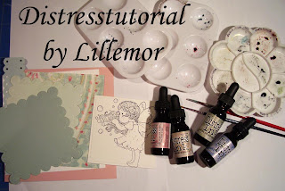
"ink refill-storage" you can se here below.
Even the bigger brush is small at the tip when it´s
wet and I also use it for colouring.


I keep a couple of inkdrops in every box in
this storage. Then I take a drop of ink with my big brush
on my colouringpalette.
Now I have a little problem as I´ve got
some new colours and there is no room for them here...
So I just might have too make some changes about it later on.


Here I have mixed tattered rose + vintage photo+water
for skincolour and added it around the face.
I always start around the edges. I put clean the brush
in water to take away the colour. Then i gently toch the
brush on some soft tissuepaper to get it almost dry.
With circlemoves I put the colourline in to the middle,
trying to leave i bright spot in the middle.

I might have to clean the brush from colour
several time to not get to much colour at the area.
I let the colour dry a little and then
I do the same thing again.
I put on colour 2-3 times for skin always
starting in the edges to get nice shaddows.


Here the face got unusally bright,
and I have put the colour to much into the middle.
It´s not easy to take pictures at the same time...;o)
The face certainly needs more colour!

While it´s drying a little I start colouring Tildas
arm, that not is next to the face. This is very important
to think about, otherwise the colour will get mixed up´
with each other and it will ruin the image.


I always colour different parts of the image that is
not next to each other to avoid the colour to get damaged
and mixed up.

With my bigger brush I make circlemoves softening
the colour.

Here I have added skincolour on Tildas arm for
the second time. Then I clean the brush in water
and touch the brush gently on some tissue paper.
Then I softs the colour with circlemoves
from the edge of the area, leaving a brigh spot.
I tries to think how the light is falling
and keep the shadows at all areas in the
same position...This is truly something
I thinks is very hard but it´s just to
practice and practice over and over again....

Here I have put some Broken China on Tildas
beatiful wings. You can see that I start with really
light colour in the beginning, to avoid getting to
much at the area.


Here I have added victorain velvet on Tildas
dress and the top of her wings.
Colouring a image can takes some time for me...
It´s not anything I can hurry up with.
I keep turning back to areas several time,
3-5 times to get sharper shadows.
Sometimes i also mixes disress ink colours with
each other. To get new colours ot to get a darker
colour that I can use for shadow.
If I want to get "shadowcolour" I usually mixes
it with walnut stain, weathered wood or black sooth.
It´s important just to put a little of this shadowcolour
around the edges and not circle it into the middle so much,
otherwise the whole area will get this colour.


Now you can see the shadows taking place.
For the hair I have antique linnen, walnut stain and
vintage photo. I tries to keep some areas bright.

When the image is ready and dried it remains
to get a nice contourline around Tilda.
I have used faded jeans here.
You can use any colour but I prefer this one.
First I put the colourline around Tilda
and then I take rather a lot of
water into the big brush. I softens the
colourline all round her and it will make her
"pop out" from the paper.
It is important to just work in the colourline
and not tuch the colour on Tilda with the brush. As I have
rather a lot of water in the brush, it might mix
up the colours otherwise...

Here is the finished card!
I have cut out Tildas wings for that nice
popup look.
Thanks for visiting me today!