söndag 30 maj 2010
Bon voyage 2010!
lördag 22 maj 2010
Another graduationcard...
Hi!
circle textstamp that I really like.
Leaves: Marta Stewart punch and Qk.
Flowers: The little one from Wild orchid crafts
Ink: Memories black and distress ink.
leaving a little note in here...:o)!
tisdag 18 maj 2010
Mothers day...
lördag 15 maj 2010
Princess Tilda...
Big green flower: handmade
Patterned paper: Studio light designed by Tina Wenke
Ink: Making memories black, distress ink,
Staz on Timber brown.
fredag 14 maj 2010
Wedding Collection 2010
onsdag 12 maj 2010
Summervacation...
tisdag 11 maj 2010
Shirtcard...
Hi!
Today I want to show you my very first
shirtcard! It was so much fun to do,
and not complecated at all!
You can find the description here.
embellishments, as the card is made for
my son man taking his confirmation.
The stamps comes from Magnolia.
Bye bye!
söndag 9 maj 2010
Another graduationcard...
Today I want to show you my second graduationcard
for the season. I have used "BallerinaTilda".
I belive I have written several times the same sentence:
"This is my new favouriteTilda"!
I always fall in love with Paulines new stamps and there
is always some that I keep closest to my heart,
this little darling for example!
She is so perfect, she suits so many occations
for making a card for someone special.
***
Alfabeth: qk Chandelier
Ink: Memories black, distress ink
Colouringpaper: Aquarellpaper 300 gr
Flower: Nestabilites flower die
Crown: Cuttlebug die
Butterflie: KarenMarieklip
Have a real nice sunday!
onsdag 5 maj 2010
The first graduationcard...
...so far this year.
It will be followed by more in the near future!
I have made a card for my daughters best friend.
I used Tilda from Magnolia (last summer)
and a new fence from the easterstamps this year.
The text is printed out from the computor.
"DIANA" is made by my clearstampsalpabeth
Paper: Maja Design "Crea Diem"
Flowers: Wildorchidcrafts
söndag 2 maj 2010
Distresstutorial...
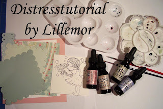
Hi everyone!
visitors here at my Magnoliablogg sence june 2009,
This is a just how I do. There is so many different ways
with small or big differences in how people colour
there images.
and never get boored, I want to share mine with you.
what kind of card I am making.
If I have a new image to colour I might just colour
it in the colours I´d like at the time.
This is the most exciting way to create I think-
I usally have an ideá about the card, something
I want to try or something I´ve seen somewhere else but
I never really know how the card will turn out in the end.
at the material that belongs to the image first.
I study colours on paper and embellishments
The paper is an aquarellpaper 300 gr with smooth surface.
I by it at Claes Ohlsson in Sweden.
I have two syntethicbrushes I use, 2 and 4.
I use the bigger one to pick up distress from the
"ink refill-storage" you can se here below.
Even the bigger brush is small at the tip when it´s
wet and I also use it for colouring.
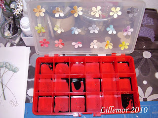
this storage. Then I take a drop of ink with my big brush
on my colouringpalette.
Now I have a little problem as I´ve got
some new colours and there is no room for them here...
So I just might have too make some changes about it later on.
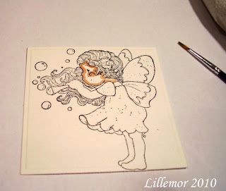
Here I have mixed tattered rose + vintage photo+water
for skincolour and added it around the face.
I always start around the edges. I put clean the brush
in water to take away the colour. Then i gently toch the
With circlemoves I put the colourline in to the middle,
trying to leave i bright spot in the middle.
several time to not get to much colour at the area.
I let the colour dry a little and then
I do the same thing again.
I put on colour 2-3 times for skin always
starting in the edges to get nice shaddows.

Here the face got unusally bright,
and I have put the colour to much into the middle.
It´s not easy to take pictures at the same time...;o)
The face certainly needs more colour!
arm, that not is next to the face. This is very important
to think about, otherwise the colour will get mixed up´
with each other and it will ruin the image.
not next to each other to avoid the colour to get damaged
and mixed up.
the colour.
the second time. Then I clean the brush in water
and touch the brush gently on some tissue paper.
Then I softs the colour with circlemoves
from the edge of the area, leaving a brigh spot.
I tries to think how the light is falling
and keep the shadows at all areas in the
same position...This is truly something
I thinks is very hard but it´s just to
practice and practice over and over again....
beatiful wings. You can see that I start with really
light colour in the beginning, to avoid getting to
much at the area.
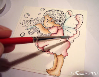
dress and the top of her wings.
It´s not anything I can hurry up with.
each other. To get new colours ot to get a darker
colour that I can use for shadow.
If I want to get "shadowcolour" I usually mixes
it with walnut stain, weathered wood or black sooth.
around the edges and not circle it into the middle so much,
otherwise the whole area will get this colour.
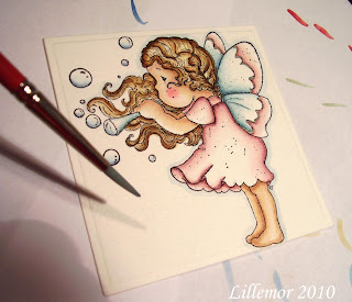
Now you can see the shadows taking place.
For the hair I have antique linnen, walnut stain and
vintage photo. I tries to keep some areas bright.
to get a nice contourline around Tilda.
You can use any colour but I prefer this one.
First I put the colourline around Tilda
and then I take rather a lot of
water into the big brush. I softens the
colourline all round her and it will make her
"pop out" from the paper.
and not tuch the colour on Tilda with the brush. As I have

lördag 1 maj 2010
Bubbling Tilda...
Hi!
I know it´s been awfully quiet in here for some while.
In this time of year it always seems to be so much
to do and so little time...
Today I had some time to sit down with my new
stamps and colour them. This new "Bubbling Tilda"
from Magnolia is so fun to work with!

Card Reciepe:
Cardstock; pink, white, turquoise and mintgreen.
Patterned paper: MME wild asparagus "sweet little one"
Stamp: Bubbling Tilda from Magnolia
Text: Melissa Franches clearstamps
Ink: Making memories black and staz on timber brown.
Flowers: Tabbycrafts, wildorchidcrafts
Butterflies: Karen Marie clip Panduro.
Corners: Pagoni
Stickles: Stardust and Platinum
Colouringtechnic:
Distress ink refills on aquarellepaper 300 gr
Colours:
Skin: vintage photo+tattered rose
wings: broken china+victorian velvet
Dress: victorian velvet
Hair: Antique linnen, walnut stain and vintage photo
Around the image: faded jeans
